A simple plot with Python and Bokeh

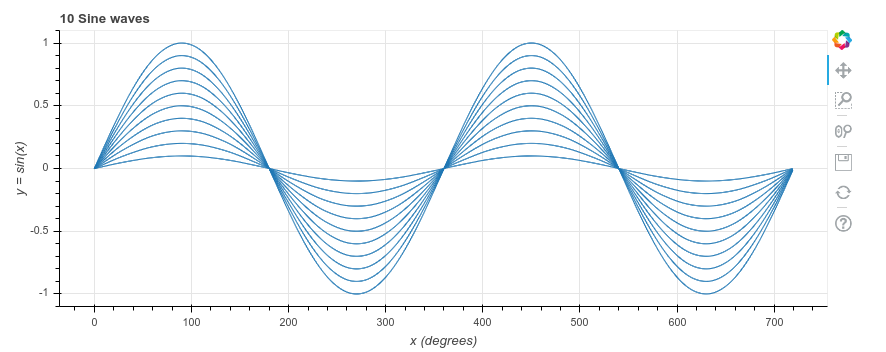
Python is a simple but powerful language, and comes with a wealth of libraries. The chart above took just 9 lines of Python. All the hard work is done by the Bokeh library. It shows the chart in your browser, where you can zoom in and move around the chart.
Here is the annotated code. You can find the raw code at the end of this post or at the GitHub repository
Before installing Bokeh, to keep your Python version(s) clean, you may want to set up a virtual environment first
To install Bokeh: pip install bokeh
1. from bokeh.plotting import figure, show Import part of bokeh, so we can create and show a figure
2. import math We’ll use the math module to generate the points on the charts
3. x_values = range(0, 720) The x axis contains the numbers from 0 to 719 (Python stops just before 720)
4. y_values = [math.sin(math.radians(x)) for x in x_values] For each of the x values, the y value is sine of x. Python’s sin function expects the angle in radians rather than degrees. math.radians converts from degrees to radians. We use something called ‘list comprehension’ here, to build up the list of y axis values. It creates a new list, which consists of the sine of each x (converted from degrees to radians) in the original list.
5. p = figure(title=’10 Sine waves’, x_axis_label=’x (degrees)’, y_axis_label=’y = sin(x)’, plot_width=850, plot_height=350) Create an empty Bokeh figure, and set the title, labels, width and height
6. for i in range(10): We’re drawing the same sine curve 10 times, at 10%, 20%, … 100% of the full height For i is 0, 1, 2, 3, 4, 5, 6, 7, 8, 9, do the following:
7. factor = 1 – i/10 Calculate the scaling factor, as (1 – 0/10) = 0, (1 – 1/10) = 0.9, (2 – 2/10) = 0.8, 0.7, … 0.1
8. p.line(x_values, [y * factor for y in y_values]) Add a line to the figure, using the original list of x_values, but scale down the y_values by the current factor
9. show(p) Ask Bokeh to show the result in your browser
1. from bokeh.plotting import figure, show
2. import math
3. x_values = range(0, 720)
4. y_values = [math.sin(math.radians(x)) for x in x_values]
5. p = figure(title='10 Sine waves', x_axis_label='x (degrees)', y_axis_label='y = sin(x)', plot_width=850, plot_height=350)
6. for i in range(10):
7.     factor = 1 - i/10
8.     p.line(x_values, [y * factor for y in y_values])
9. show(p)


