Retrieve and display a data set

(First part of the “Practical Python in 10 lines or less” series)
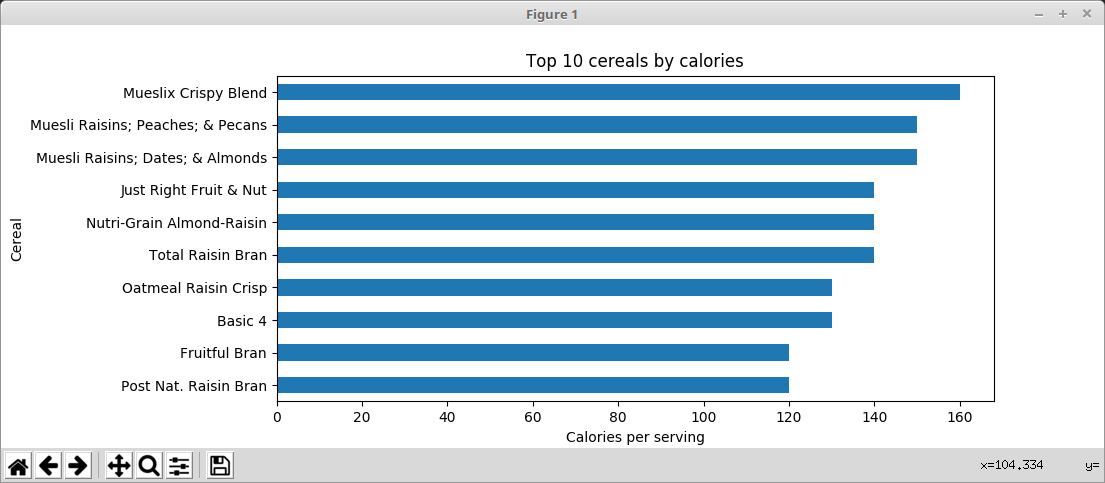
Python is a simple but powerful language, and comes with a wealth of libraries. The chart above took just 10 lines of Python. All the hard work is done by the Pandas and MatPlotLib libraries.
The code
import pandas, matplotlib
data = pandas.read_csv('http://www.betterpythoncode.com/wp-content/uploads/2019/04/cereal.csv')
data = data.set_index('name')
data = data.calories.sort_values()[-10:]
ax = data.plot(kind='barh')
ax.set_xlabel('Calories per serving')
ax.set_ylabel('Cereal')
ax.set_title('Top 10 cereals by calories')
matplotlib.pyplot.subplots_adjust(left=0.45)
matplotlib.pyplot.show()
How it works
You will need Python and the Pandas and MatPlotLib libraries. See the installation instructions
Get started
1. import pandas, matplotlib
Grab the libraries we need to load, clean up and display the data.
The recommended approach (PEP 8) is to have two import statements on separate lines. To leave enough lines to make the chart look good, in this example I have combined them.
2. data =
pandas.read_csv(‘http://www.betterpythoncode.com/wp-content/uploads/2019/04/cereal.csv’)
Load
the csv data from a website. This gives us a pandas DataFrame, a two
dimensional datastructure similar to a page in a spreadsheet.
I
downloaded the data from
https://www.kaggle.com/crawford/80-cereals/version/2,
under Attribution-ShareAlike 3.0 Unported (CC BY-SA 3.0)
[https://creativecommons.org/licenses/by-sa/3.0/]
3. data = data.set_index(‘name’)
Set the row names
(index) to the ‘name’ column. When we plot the data this becomes
the data labels.
4. data = data.calories.sort_values()[-10:]
Take the
‘calories’ column, sort it and limit to the last 10 values. This
gives us the 10 cereals with the highest calories per serving
5. ax = data.plot(kind=’barh’)
Plot the data as a
horizontal bar chartax.set_xlabel(‘Calories per serving’)
6. ax.set_ylabel(‘Cereal’)
7. ax.set_title(‘Top 10 cereals by calories’)
8. ax.set_xlabel(‘Area in millions square kilometers’)
Set the label for the x and y axes and the title
9. matplotlib.pyplot.subplots_adjust(left=0.45)
Set the
left margin (from the left of the image to the left of the chart
area) to 45% to give enough space for the cereal names.
10. matplotlib.pyplot.show()
Show the chart


